
Reduce avoidable drop-off
Research and quantitative data showed users encountered password requirements too late, creating confusion and abandonment.
Vimeo · Growth design
A registration system that turned sign-up into a growth surface.
Overview
Four experiments over seven months with one goal: reverse declining subscriber growth through smarter registration design and personalized plan merchandising. The work modernized sign-up, introduced customer profiling, and improved first-time subscriber conversion and downstream engagement.
Registration & Sign-In Flow was a sequence of experiments redesigning how new users sign up for Vimeo. As design lead, I partnered with engineering and product marketing to modernize the experience, introduce customer profiling, and test how plan placement and presentation could increase first-time subscriber conversion.
That conversion metric was Vimeo’s number-one company KPI in 2025, so the work balanced immediate growth pressure with durable improvements to the registration system.
Research and quantitative data showed users encountered password requirements too late, creating confusion and abandonment.

Registration needed to move onto Vimeo’s Bokeh component system, improving visual consistency and reducing accumulated technical debt.

A lightweight profiling step would capture use case, role, and team size at scale while creating an input for later personalization.
Registration needed to move onto Vimeo’s Bokeh component system, improving visual consistency and reducing accumulated technical debt.
Registration flow rebuilt using Bokeh design system components.
Password strength indicator added so users could see in real time whether their password met the criteria, instead of finding out after submission.
Three profiling questions added as a new step: how you plan to use Vimeo, your role, and team or business size. Each question also allowed the user to skip if they wanted.
User interviews and support-ticket analysis surfaced frustration with rejected passwords and unclear guidance.
Drop-off metrics confirmed the password error was measurably contributing to registration abandonment.
Product Marketing’s profiling need aligned with the opportunity to redesign registration end to end.
The Bokeh rollout created technical urgency. Critical paths needed to be rebuilt with the new component library, and registration was identified as a priority.
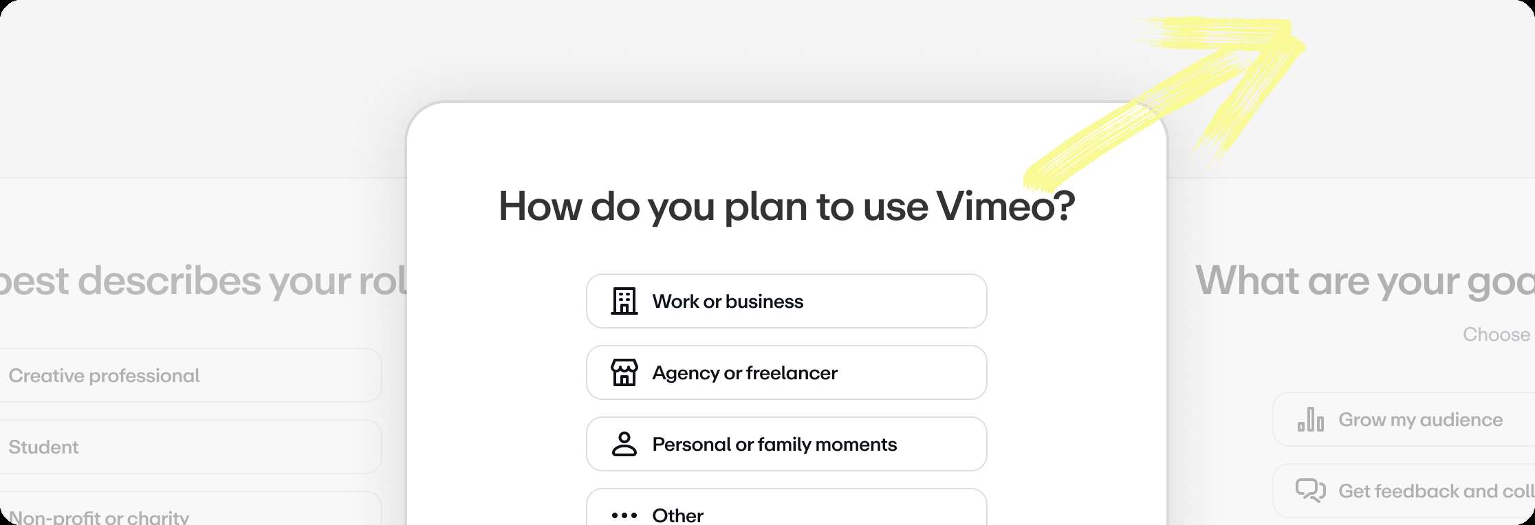
These profiling questions were a top priority for Product Marketing. The data helped build a clearer picture of who Vimeo's new users actually were and what they intended to do with the platform.
The three questions were designed to be low-friction and feel purposeful. Use case, role, and team size. Each page had a Skip option so users never felt trapped. The data collected here became the input for personalization in later experiments.


The placement shift was the key variable. Everything else about the plan selection UI stayed consistent so we could isolate the effect of where it appeared.
The three questions were designed to be low-friction and feel purposeful. Use case, role, and team size. Each page had a Skip option so users never felt trapped. The data collected here became the input for personalization in later experiments.
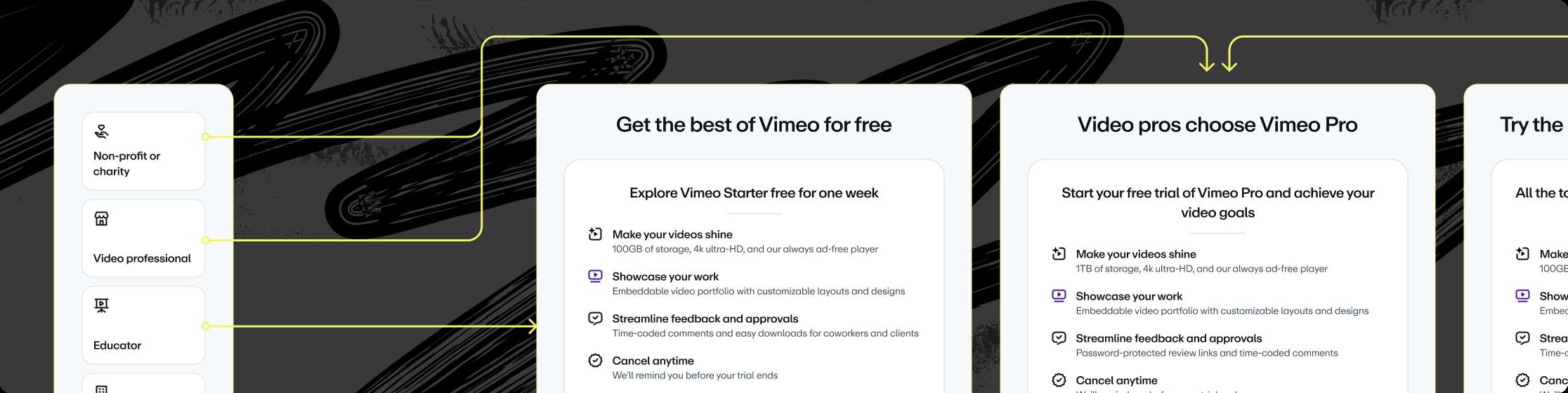
Experiment 2 brought plan selection into registration rather than surfacing it after the fact. By placing it after profiling, we hypothesized that users would be more receptive to plans because they had already provided context about what they needed Vimeo for.

This experiment was still running when I left the team. The direction was clear. Profiling data was the input. Personalized presentation was the lever.
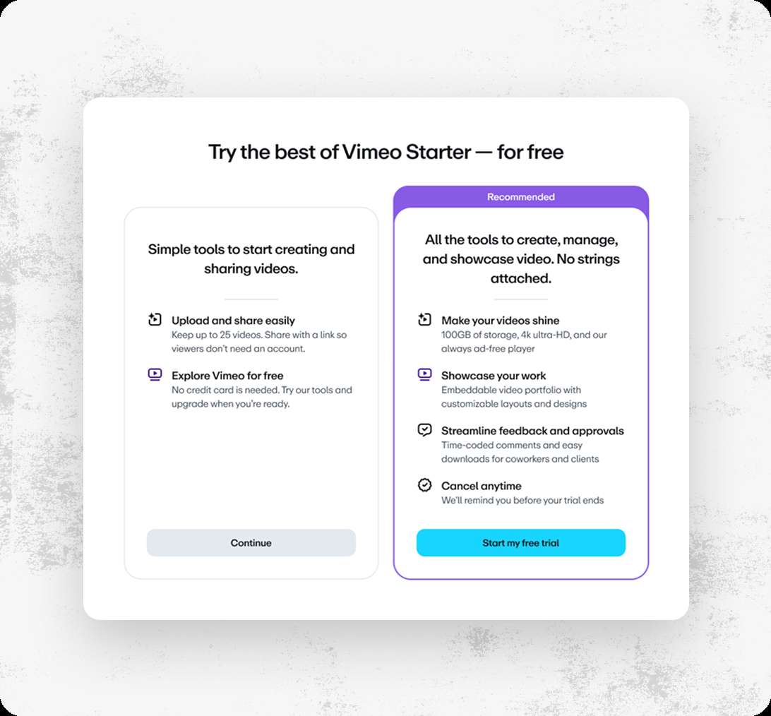
Experiment 3 narrowed the choice. Instead of presenting all available plans, users saw a single plan automatically selected based on their profiling answers, plus an option to continue for free. The goal was to reduce decision fatigue at the moment users were most likely to convert or drop off.

One of the friction points the early research surfaced was the password creation step. Users would fill out their password, hit submit, and only then find out it didn't meet the strength criteria. By the time they got that feedback, some had already left. The fix was straightforward: show the criteria in real time as users type.
This was part of Experiment 1, but it deserved its own moment because it was the most direct response to something users actually told us was frustrating.

Breaking a large registration redesign into three experiments wasn't just a risk-mitigation tactic. It was a way of learning incrementally. Each experiment gave us a cleaner signal about what was working and what wasn't. The tradeoff was speed. It took longer to ship the full vision. But the data quality at each stage was significantly better than it would have been from a single large change.
The customer profiling flow started as something Product Marketing needed. But it became the input that made personalization possible in experiments 2 and 3. It shifted from a data collection step to a decision-making input. That was one of the more interesting design problems in the project. The skip rate on those questions was something we were still working to reduce when I left.

The registration flow included an automatically scrolling wall of video thumbnails in the background. That piece required more infrastructure than it might look like. I set up read-only access to an internal spreadsheet tracking which videos we had the rights to use. I built a Figma workspace that would import thumbnails and size them for both desktop and mobile layouts.
That same workspace also exported the atomic pieces a designer would need to update the After Effects animation. The After Effects file itself was templated so that swapping in new thumbnails only required replacing one source file. The whole system was designed so that a future designer could maintain it without rebuilding anything from scratch.
Future work on this project would have focused on reducing skip rates on the profiling questions, refining the questions themselves, and continuing to test how the answers could make plan selection more effective.